
Are Your Website Contact Forms Helping or Hurting Leads?
Chris Mulvaney is the CEO of CMDS. I make things... I’m the creative entrepreneur with passion for (re)making brands and inventing solutions to problems no one knows exist.
Website contact forms are a fundamental part of a website design and a catalyst for conversions, which is why usability is vitally important. While every brand is different, here are some good guidelines to follow in the world of shrinking attention spans.
What are Website Contact Forms?
Website contact forms are an easy way customers can communicate with you on your website. Whether you’re a small local business or a nation-wide enterprise, communication is a must. They are commonly used for inquiring about your product or service, signing up for a white paper or downloadable, RSVPing to an event or webinar, submitting a customer support ticket, or simply getting in touch. The lack of a contact form, or a poorly designed one, can put your reputation at risk and simply cause frustration for your website visitors.
With the right website contact form, brands bring a level of professionalism and efficiency to customer communication that help them capture valuable leads and get ahead of the competition.
4 Must-Have Elements of Website Contact Forms
 Effective website contact forms are designed to get you information, fast. A Google eye-tracking study showed that by following the most basic usability guidelines for form design, businesses can significantly improve user experience. Specifically, when contact forms follow all the rules, 78% of their users will complete and submit them in one, single try. But, when contact forms violate those rules, only 42% can do it in one attempt.
Curious to know what those elements are? Keep reading.
1. Captivating Design
- Draw people in with the title of your form. Visitors should clearly understand what they’re filling out on your website contact forms and know what’s going to happen next. Don’t leave them in the dark. The headline of a form should be clear and compelling.
- Simply having a contact form on your website is not enough, it must be strategically placed for users to access easily, have the right copy and without-a-doubt, entice the visitor to fill out the form and click.
- Considering time of engagement peaks above the fold, be strategic about website design and where you place your form to optimize conversions.
- Since consumers are accessing websites on a variety of screen sizes in today’s multi-device age, they want a great experience no matter what device the tab is open. Bridge the gap between the mobile and desktop experience with optimized website contact forms.
- Great form design removes any and all barriers. Explain what’s going to happen after they click that button. Will they receive a phone call, get a free proposal, etc.? Knowing the outcome can be a strong motivator.
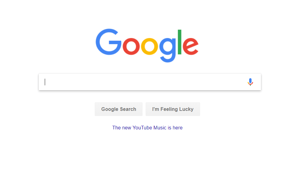
- Finally, don’t be afraid of white space, also referred to as negative space. Google does a good job with that. Their website is filled with whitespace so users can focus on what is important: search.
2. Fields that Flow
- Be selective about which fields are required on your contact form. Don’t ask for too much information or you could scare customers away. Allow some fields to be optional (like the phone number) or people will give up before they even start.
- Want more conversions? Use less form fields. Research shows that people get paralyzed by too many choices, so keep it short and sweet, if possible. A study by Hubspot shows that reducing the number of fields from four to three brings a 50 percent improvement in conversion rate. So, get the information you need and don’t be too picky about the rest. You’ll get it later.
 When consumers land on your website, they want to be able to accomplish what they came for with minimal effort. Nothing’s more frustrating than trying to fill out a badly designed form. Error messages kill conversions, especially for a less-than-motivated user, so make it as easy as possible for them. Show any error messages as soon as the user has engaged with it rather than waiting until the end.
- Remove as many barriers as possible by setting smart defaults. For example, instead of requiring visitors to search for their country in a long list, consider suggesting their country based on their IP address.
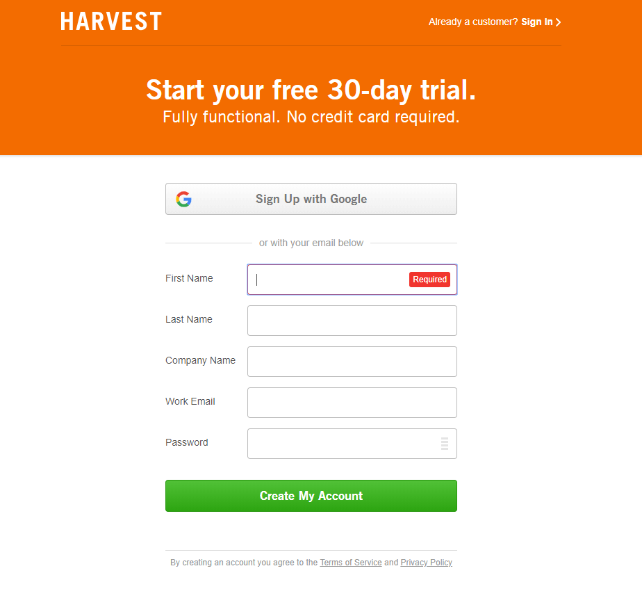
- Leave no question in their mind what they’re filling out and why. Field labels must clearly describe any formatting requirements, state when a particular field is required and flow from one field to the next. Harvest does a good job answering any concerns about credit charges right upfront.
3. Call-To-Action
- Your call-to-action must inspire users to take action with a strong and catchy statement or icon. This, right here, is the tipping point between a conversion and a bounce. A strong CTA compels people to click, an unclear CTA will send them away.
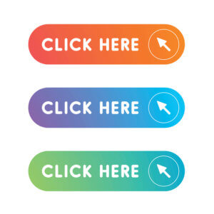 Never use the word, “submit” as the CTA. Not only is it boring, studies show that the word “submit” is just not descriptive enough. Actionable words like “go,” “get a quote” and “click here” experience much higher conversion rates compared to other options like “submit,” “download,” and “register.” What words you choose depends on the site and the overall goal of the form.
- Don’t be afraid to experiment with unique C2A copy for your buttons. Consider using the first person point of view, for example, choose: “Create My Account” vs “Create Your ” And, leverage a specific number to demonstrate authority and reputation. For example, on a newsletter form for a restaurant you might use, “Join Over 100,000+ Food Lovers.” Social proof is a powerful motivator because they instantly view you as a brand people trust.
- What works for them may not work for you. The only way to determine what works best for you via A/B split testing. A simple tweak on your forms can make a huge difference.

- When it comes to conversions, the color of your button also matters. Choose a color that stands out from the rest of the design rather than blends in. For example, a dark-themed site should have light-colored buttons so they stand out. According to a number of studies, red is the highest performing color, but don’t underestimate the performance of other colors. Here’s a little psychology reminder about colors:
- Red: Color of youthfulness and joy. Red also reflects boldness and confidence.
- Green: Evokes a calming effect and a peaceful, progressive emotional response.
- Blue: Reflects trust, strength, reliability.
- Black: Secures a sophisticated, emotional response.
- White: Think clear and simple.
- Yellow: Color of optimism, warmth, friendliness.
- Orange: Creates a fun and friendly effect.
- Pink: Associated with sensuality, femininity and love.
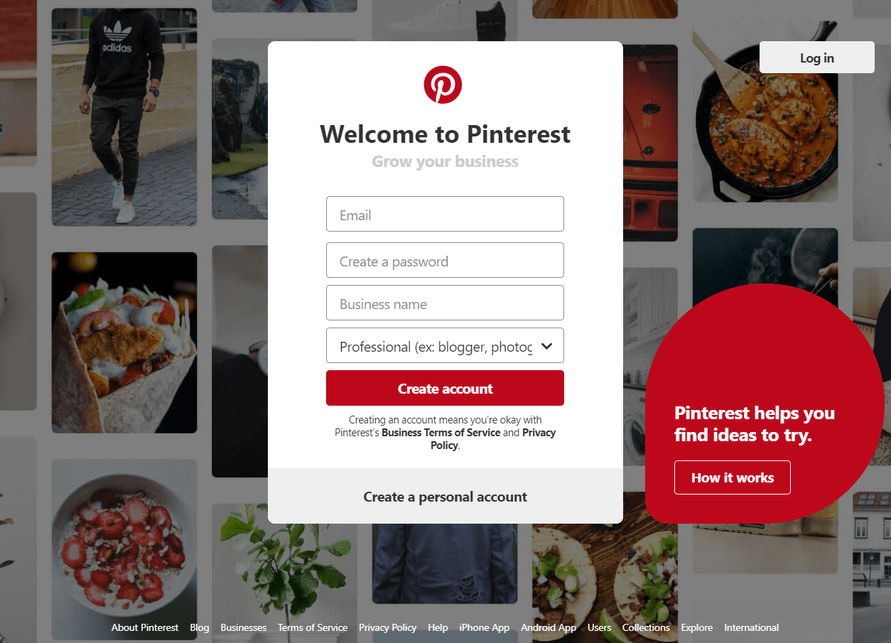
Remember, none of these colors will matter if your call-to-action button does not stand out! Pinterest does a good job standing out with a red button even among a scrolling background.
4. Data Collection
- Every industry is becoming increasingly data driven. The more you know about your customers, the bigger advantage you’ll have over the competition. Properly functioning forms are designed to streamline the entire follow-up process and respond in a more timely fashion.
- Seamlessly integrate forms with CRM programs to enhance workflow. This makes email marketing efforts extremely productive.
- Show your users a confirmation message after they’ve filled out the form. Use it as an opportunity to direct them to a landing page with relevant resources they will appreciate and find useful in the meantime.
- A note on security. You may have already heard of the General Data Protection Regulation (GDPR), the European data protection regulation that any organization is required to comply with that processes or stores any personal data of EU citizens. Protect personal data by following appropriate security measures.
- Before collecting any user information, it’s essential to obtain and confirm consent. This must be in clear, easy-to-understand language, free of legalese. Do not bury this in other text.
- Provide a clear privacy policy that informs the user how the data will be stored and used.
- Have a means for users to view the data you have collected on them and withdraw their consent as well.
- Use a single checkbox next to the Terms and Conditions agreement to make consent very clear.
Read more >> “GDPR for US Websites: Here’s What Businesses Need To Know About Site Compliance”
Reel In Customers With Website Contact Forms That Work
Whether you’d like visitors to download a whitepaper, schedule a free consultation or just get in touch, polished website contact forms can help make it happen. But, as you can see, the way you lay out your contact form can have a significant impact on whether people actually bother with submitting the form. Even if you’ve sold them on whatever it is that you have to offer, a contact form could essentially lose the lead if not executed well.
Are your website contact forms helping or hurting leads? We’d love to chat through ways to turning your contact forms into lead gen magnets. Contact us to set up a time to talk today.
