
An In Depth Look at How Website Design Affects Conversion Rates
Chris Mulvaney is the CEO of CMDS. I make things... I’m the creative entrepreneur with passion for (re)making brands and inventing solutions to problems no one knows exist.
There is a difference between a gorgeous website and a good website. Just as there is a difference between a high-traffic website and a high-converting website. The truth is, there are a lot of ways that website design affects conversion rates — and most of them actually have nothing to do with color choice or which picture is on the homepage.
Build a High Converting Website With 3 Website Design Features
When it comes to driving conversions, the best websites have three things in common:
- Drive visitors along a specific path
- Put stuff where visitors will see it
- Give visitors a reason to trust them
Let’s take a look at each of these factors individually.
1. Invite the Action You Want by Limiting Choices
One of the worst mistakes a website can make is to give too many choices to their visitors.
This seems counter intuitive in a way. After all, doesn’t it logically make sense to cast a wide net with your website, ensuring that you can answer any question or concern they may have?
Do you list every product and service that you offer in your nav bar?
Are all of your research / case studies / cool stuff available from the home page?
Does your home page feature more than three options above the fold?
Providing too many options for a user is a classic case of trying to do the right thing in the wrong way.
Yes, you want to have an easy and seamless user experience. Yes, you want them to have the information they need in order to purchase something from your site. And yes, you want them to feel like they are in control.
But, the mistake is in actually giving it to them.
In fact, one of the biggest ways website design affects conversion rates is by giving the customer the illusion of being in control, when in fact, you are leading them every step along the way – on the path that YOU want them to take.
Offering too many choices is the same as offering too many distractions. Distractions equal temptations to leave your site
When you are developing a new website, the most important consideration to make is the user path. Sit down with your marketing team, web designers and stakeholders and carefully determine the ideal path customers should take in order to purchase.
Once you have determined the steps you want visitors to take, build your website architecture around that. From the first second on your site, you should be driving them towards that conversion.
How do you do this?
Be clear and concise in your unique selling proposition. Why you? Tell them exactly what they will get.
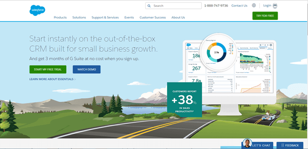
Here, Salesforce does a great job highlighting their USP: 1) No wait 2) Ready built 3) Small business focus 4) Free trial.
They give you two options: Start now or watch the demo for more details. The first is an instant conversion. Watching the video takes visitors to a landing page with more information and a form to fill out in order to watch the demo. Either one is a win. Both earn contact information for future leads.
Are there common questions customers have? Address them immediately – don’t make them search for answers or be forced to initiate the sales process to find out.
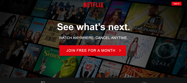
Look at how sparse the home page for Netflix appears. Then realize that everything on it is hard-working, driving you towards a conversion. Right off the bat they tackle three major questions (in just 12 words!)
1) Can I watch Netflix on my phone/tablet?
2) How hard is it to cancel if I don’t like it?
3) Can I try it out to see if it is worth it for me?
Now, Netflix has removed multiple barriers to conversion and made it extremely simple to sign people up for a free trial. No one had to commit time to going through the sign-up process in order to find the cancellation policy or read the spec details. By eliminating common questions, and removing distracting options, Netflix has turned their homepage into a conversion machine.
Keep your form short. Every extra field decreases your ability to convert.
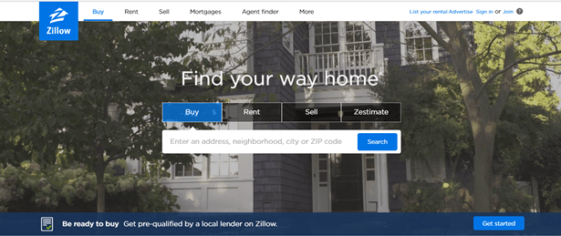
When you consider the fact that more than half of your web traffic is on mobile, minimizing fields is critical. Zillow has one field on its homepage. They make it easy for visitors to self-select whether they are interested in buying, renting or selling and simple to get started.
Instead of having to navigate maps, housing specs and detailed questionnaires, Zillow streamlines the process and gets visitors active and engaged in their site quickly.
Once you have decided what action you want your visitors to take, the rest of your website content can be filled in around this initial path.
Does your company have a best seller? Or an item that earns the lionshare of the profit? Focus on it. Push your audience directly to that purchase. Don’t offer the red and the blue versions.
Does this mean you can only talk about one thing on your home page? No. But the easier you can make it for your customers to get what they are looking for, the better your odds of conversion will be.
When your web designers focus on framing the site experience to allow visitors to go from entry to purchase in as few steps as possible, they have fewer opportunities to get lost along the way. And you get more conversions.
2. Position Conversion Drivers Where People Will See Them
There is a not so secret trick to getting people to read your stuff – put it where they are actually looking.
This is different in websites vs magazines vs emails vs any other type of marketing.
On a website, there is the “F” zone.
F-Zone
Determining the right layout for your content is another important way that website design affects conversion rates. Big time ad spenders have conducted numerous studies examining exactly where people look first and most (and least and last) on websites. These “heat maps” tell advertisers and marketers exactly where to put their content and how to prioritize it.
In almost all cases, the eyes follow an “F” shape. Identified in 2006, by NN/g, the “F” pattern shows how web visitors scan across the top row and then down the left margin. (Download a copy of the full report from their site and review it before starting any website design project.)
The top and left of the pages has the most visibility, where the areas on the right side of the page receive the least amount of eyeballs.
See example here:
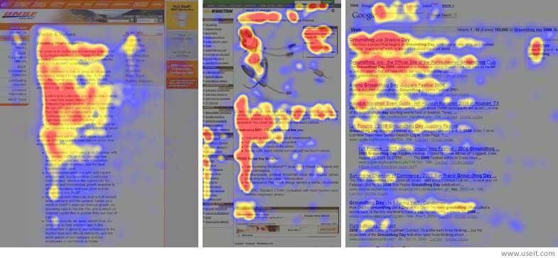
Much like weather maps, areas in red indicate heavier traffic, where areas in blue are the lightest.
Smart web designers pay attention to this behavior when designing websites — and when figuring out how to design for higher conversion rates..
We know that very few people read a web page from start to finish.
They scan it.
If they find what they are looking for, they may go back and read that section completely. In some cases, they may read the whole page. But, first, they scan it.
A web designer’s job is to put the most important / persuasive / relevant content where they are scanning.
How Can the F-Factor Increase Your Conversion Rate?
Embrace it. Have your web designers factor it in from the start of the design process.
1.) Put all the most important information at the top. This means, stop writing like a novelist. Front-load your important points, because it may be the only thing people read. You need to get them hooked from the first paragraph, the first offer or the first statement.
2) Make smart use of your headlines and subheads. Readers are scanning them for hints as to what the content is about, so they need to be informative, but also inviting enough to make the reader want to delve deeper into your site.
3) Don’t rely on text alone to attract readers’ attention. Design is never more important than when people are scanning. Use formatting to highlight important content. Bold, italic, underline – all can be used strategically to capture the eye.
4) Using pictures to break up text heavy areas can disrupt the F-pattern. Adding call-outs or visual emphasis to important sections can also grab and hold interest.
5) Don’t hide things on the right sidebar. The right side scroll area is the least viewed area of a page. If you are looking to upsell or convert, make sure your action buttons are not in dead space.
The Rule of Thirds
In addition to the F-pattern, visitors subconsciously divide your website into thirds, forming a grid of nine boxes. The intersections of these imaginary lines are power positions for your content.
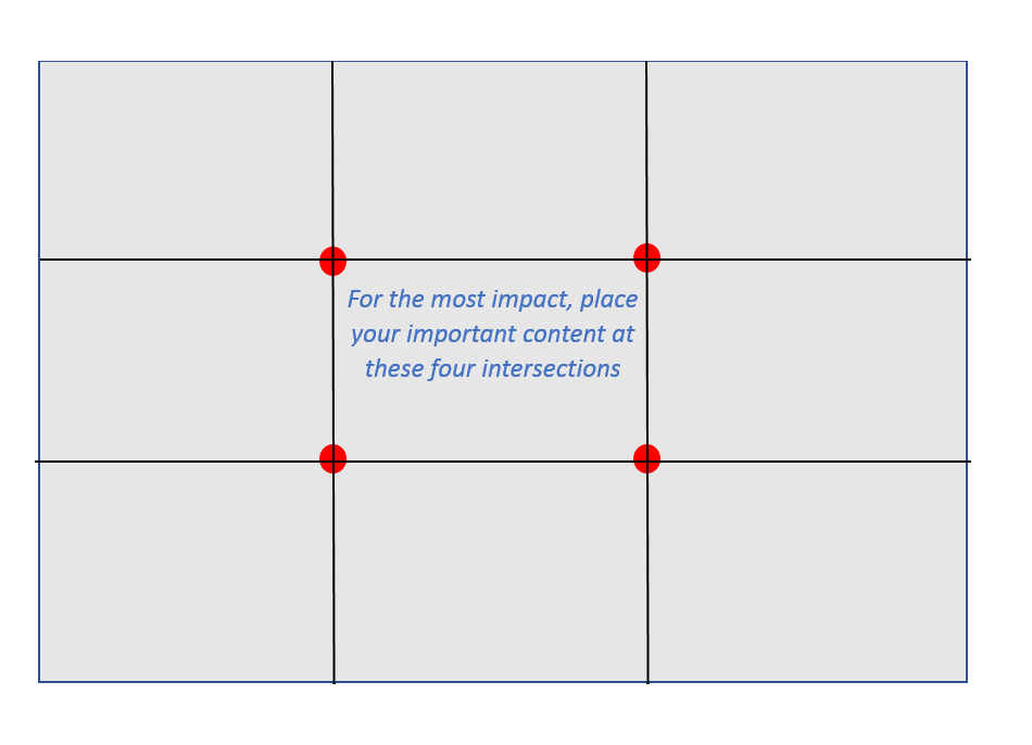
The Rule of Thirds takes a look at just the area above the fold. This is the most important area of your site. Consider placing Items like action buttons at one of these intersections, or along these lines.
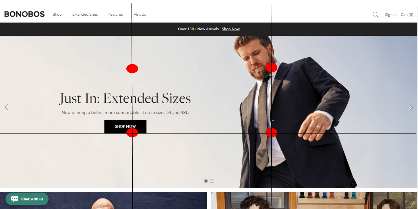
Take a look at the Bonobos site using the Rule of Thirds in their web design in order to increase conversions. They have placed their conversion button directly at one of these intersection points. They eye gravitates to this spot subconsciously.
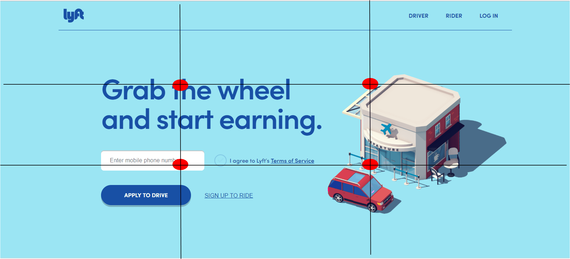
Here, Lyft is placing their hero copy on one intersection and their only field on another intersection.
Web designers shouldn’t start with the Rule of Thirds, but compare the final stages of the site layout to the grid. Use the grid to tweak positioning and help draw more attention to the items you want your users to see first.
3. Good Design = Credibility
Have you ever walked into a store, looked around and seen it in a state of disrepair and just walked out?
Or entered a business that hasn’t been updated in a few decades and that immediately lowered your expectations?
Of course you have. We all do. That’s because appearances matter. We don’t trust people or businesses that don’t take care of themselves.
Is appearance the only thing that matters, no. But it sets expectations.
When a website has broken links, misspelled words, or content that doesn’t load properly, you leave and find another source.
If you visit a site where the blog hasn’t been updated in weeks, or the design is dated, where the website isn’t responsive — you begin to reconsider how much they are really invested in their product or service.
In most cases, a website is the first impression a brand will make on new customers. Companies that don’t exhibit a strong sense of pride in their website will give the impression that they don’t care about their customers.
A well designed, updated site lets visitors know that you are doing well enough to invest in your brand. It lets them know that you are a trusted, reliable company that they can safely consider doing business with.
In fact, Stanford conducted a study that proved that 46.1% of visitors consider a web site’s design as a major factor in credibility. With all of the privacy scandals and scamming sites out there, establishing credibility is the first step in gaining a conversion.
If your site does not scream “trustworthy”, you have lost a sale before you even had a chance.
Web Design Factors That Build Conversions
So what are the visual design factors that build trust, and in turn build conversions? There are a lot, but paying special attention to a few of the major ones will go a long way.
1) Responsiveness. It seems like a broken record to keep harping on responsive design, but there are still tons of sites that are not mobile-friendly. In 2018, more web traffic is mobile than desktop. Major search engines like Google and Bing have made mobile-friendliness a ranking signal, prioritizing mobile-friendly sites over non-responsive.
If a potential customer looks your brand up on their phone, and they have to pinch and zoom, you are going to lose the conversion.
2) Design for mobile. Is this the same as being responsive? No. With more than fifty percent of traffic coming from mobile, you need to design your site to be easy to convert on a phone or tablet. Make forms short. Make buttons big. Ensure autocomplete is active. Simplify check out.
3) Readability. Make sure finding information on your site doesn’t give visitors a headache. Don’t choose fonts that are hard to read, even if they are cool. Ensure that your line spacing allows the eye to scan easily.
You can’t fight scanning, so you need to make it easy for people to do so with your design. If they can’t easily scan your site because of the design, they won’t bother to look at it at all.
4) Aesthetics. The colors, fonts, images — this is what clients typically think of when they think about about redesigning their website. And it is definitely important, as it is perhaps the only thing a customer is actually aware of when they visit your site. All of the previous web design factors for increasing conversion rates are either subconscious or behind the scenes.
Once you have all of the other web design strategies working for you, your color choices and imagery help to bring it all home. Choose colors that complement your brand, saving high contrast colors for conversion buttons and call outs.
Use high-quality photos whenever you can, in lieu of stock photography (especially cheap stock photos). Your customers can tell the difference and photos that don’t follow your messaging can cause dissonance, disrupting the conversion process.
5) Embrace white space. Too much clutter distracts the eye. Use your white space to help direct attention to where you want it – conversion buttons, special offers, hero copy and high-impact images. Filling your page with color and images will turn off viewers and prevent them from focusing on the areas you want them to pay attention to.
Considering how website design can affect conversion rates is one of the major roles of web design companies. Professional web designers know that the lion’s share of work comes before colors are chosen and pictures are selected.
Your website is a sales tool. Developing it to sell your products first, and inform second, is critical to creating a conversion-oriented site. Take advantage of the years of professional website design and development experience from the experts at CMDS.
With more than 15 years designing and developing high-conversion websites, we can ensure that your new site drives the leads you need to grow to the next level. Contact us here or call 732-706-5555 to get started.
