
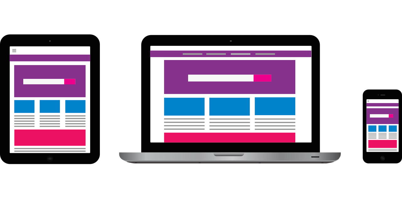
How Responsive Website Design Works
Chris Mulvaney is the CEO of CMDS. I make things... I’m the creative entrepreneur with passion for (re)making brands and inventing solutions to problems no one knows exist.
You may have spent thousands on your website and it may be lights-out-awesome, but if it’s a fixed width layout for desktop view, instead of a responsive design, then it’s just not going to look good on other devices. Responsive website design ensures that your website looks good on any device, be it mobile or desktop, no matter what.
Responsive website design goes way beyond a passing fad. It is, in fact, the future and needs to be regarded as standard practice for all web designers moving forward.
As I sit down to write this blog, it is September 18th, 2018. If you’re not creating your websites using responsive website design by now, the future is passing you by.
– CMDS
The Problem with Fixed Width Layout
You know what? I only use the internet in the comfort of my home, sipping a cup of chamomile, in a plush office chair, fingers spry and curled over the keyboard, eyes fixed on a sweet 27” iMac pro with 5k Retina Display.
The above statement describes a person that’s probably between the ages of 55 and 90 years-old. A fixed width layout is perfect for them because they only access the internet using a desktop.
That’s great. Good for them… and while I can’t discount that this sounds quite lovely, neither can I discount that it in no way represents my reality… and probably not yours.
Because we be on the internet… pretty much all the time.
So what is a fixed width layout design?
A fixed width layout means that the width of the site is fixed to a specific pixel value and, therefore, the content always displays exactly the same– same width, same length– regardless of the user’s monitor resolution, or device. In other words, the website’s design has been set to fit perfectly to a specific screen size.
It’s the “you get what you get and you don’t get upset” design mindset.
So what happens if you view that particular website with a different screen size, a size not intended by the designer?
Simple, you won’t be able to see the website as intended.
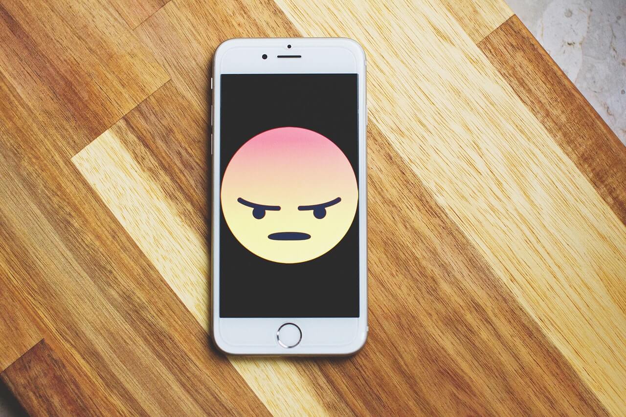
This is the moment when you get on a website using your phone and you’re zooming, and shrinking and pinching the screen just so you can click a button in the top right corner, but the button is so small you can’t press it and you’ve suddenly realized you have a thumb the size of a tree trunk!!!!
Thanks Mr. Website for letting me know I have a giant thumb. X out! And move on.
The point is, people access the internet at work, at play and at home and, generally, use whatever device is handy at the time. Today, the internet is accessed through the use of smartphones, tablets, laptops, desktops– even smartwatches for goodness sake.
Can you imagine accessing a fixed width layout with a smartwatch? Nightmare.
People access the internet first thing in the morning– check the weather on my smartphone. Access it over coffee– social media time on the tablet. Access it in our cars (which you shouldn’t do, btw) oh, no– traffic jam on I-95– can the GPS on my phone reroute me?
So you have a fixed layout for your website.
Now, for the first time, you’re considering all these people, using all these devices, doing all these searches. You realize… you never considered them when you had your website built.
There’s actually a term for this. It’s called mobile unfriendly.
Now you have to ask yourself this question…
What does my website look like through someone else’s screen?
Answer: It looks… cockamamie.
** BEGIN RABBIT TRAIL** Can we just make a pact to bring back the word cockamamie? And then, if it happens, I’d get the credit and everyone would be like, “Wow, that Responsive Web Design blog brought back cockamamie.” Thank you in advance.” ** END RABBIT TRAIL **
58% of Google searches are done over mobile devices. Yes, that resolves itself to about 28 billion more searches done using mobile devices than desktops.
That’s 28 billion potential folks viewing your mobile unfriendly website with their mobile devices.
It’s time to update your site with a responsive website design. A company like CMDS, web design firm out of Colts Neck, NJ, can help.
What is Responsive Website Design?
“Responsive design is a way of developing web properties so that the device they are used on determines the way that the site will be displayed. It’s normally done using the principle “mobile first” – i.e. the experience is defined on mobile platforms such as smartphones and tablets and then scaled up to larger screens.”
– Interaction Design Foundation
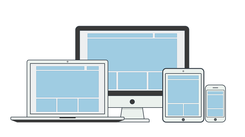
A responsive website design can customize and adapt according to the user’s screen size. This feature allows a website to look lights-out-awesome on every device regardless of user’s behavior, screen size, platform and orientation.
It’s about how your site looks on the screen.
57% of users won’t recommend a business with a poorly designed mobile site. You have to make sure it looks good.
Because looks matter, people!!!
Whoever said it didn’t, lied… It was your parents, I know.
They were the ones who told you about Santa Claus, too.
Look, I’ll be honest. I’m also guilty of telling my ugly kid that personality is more important than looks, but if that were true, then why are we Keeping up with the Kardashians?
It ain’t because they’re in the running for the Nobel Peace Prize…
3 Main Concepts behind Responsive Website Design
These are the three main concepts that enable designers the ability to improvise, adapt and overcome the challenge of one web page viewed by multiple devices.
- Fluid Grids
- Fluid Images
- Media Queries
Fluid Grids
A fluid grid system is designed with the idea of proportion in mind.
Instead of a fixed layout, rigid and static pixel values, widths and lengths; a proportional approach allows for a layout, when squeezed onto a tiny display or stretched across a huge screen, to resize elements in relation to one another.
Fluid Images
Responsive website design structures content to adapt to the size of a particular device. But what does that do to the images?
There are several potential problems that present themselves when attempting to make images look good on all devices. The most obvious being that images have fixed widths and heights. This prevents an image from adapting to the size of the display screen.
The most popular technique, and perhaps the simplest solution for this problem comes by making the images fluid.
Use CSS command:
img { max-width: 100%;}
“As long as no other width-based image styles override this rule, every image will load in its original size, unless the viewing area becomes narrower than the image’s original width. The maximum width of the image is set to 100% of the screen or browser width, so when that 100% becomes narrower, so does the image.”
– Smashingmagazine.com
Use full-sized images, without assigning height or width in the code, and allow the browser to resize them as needed while using CSS to guide their relative aspects.

Media Queries
Media queries allow you to gather data about the user, alter the layout and apply CSS styles when certain conditions are met.
A media query will tell you when and how to rearrange elements on your web page to fit the screen size. This works best with the mobile first and friendly approach. Make sure your webpage looks right on a mobile device first and work back from there.
“Media queries are key to responsive web design. A media query places a condition on whether certain styles have an effect or not. For instance, a media query could be used (to) replace a regular navigation menu with a mobile one on screens below a certain size.”
– Themeover.com
Responsive Design is not Adaptive Website Design
There is a difference.
Adaptive Website Design
Adaptive web design, at its core is preparation… perhaps at nauseum, but preparation, none the less.
Preparation you say? Why is that?
There are six basic screen widths in standard practices for designers. They are– 320, 480, 760, 960, 1200, and 1600 pixels.
Thus, a designer needs to PREPARE for all six contingencies. Essentially, creating six different versions of a single webpage in order to anticipate the best fit for the users’ screen size.
The disadvantage to adaptive web design is that it’s expensive and time consuming.
(Two no no’s in business, fyi)
Advantages of Responsive Website Design
At this point, the advantages should be obvious. Here’s a list based on Cody Aresalt’s article, 10 Essential Benefits to Responsive Web Design.
1) More Mobile Traffic – Today, most visitors come to your website through the use of a mobile device.
2) Faster Mobile Development at Lower Cost – This is the “time is money” factor. It takes less time to develop one good website using responsive design techniques than creating multiple versions of a website. It’s saves energy, too.
3) Lower Maintenance Costs – Multiple designs means multiple support. It also means multiple content strategies. Responsive design and its one-size-fits-all philosophy eliminates the extras.
4) Faster Web Pages – A responsive design optimized site uses modern techniques such as caching and responsive image displays to speed up load time.
5) Lower Bounce Rate – It’s a better user experience, thus, users will stay on your site longer.
6) Higher Conversion Rate – A great user experience that looks professional on every platform will lock in more visitors who buy.
7) Easier Analytics Reporting – Multiple versions of a website means multiple methods of tracking customers. One site, one method.
“Google Analytics and similar tools now cater to responsive websites by condensing tracking and analytics into a single report so that you can see how your content is performing on different devices.”
– Cody Aresalt
8) Improved SEO – Having one version of your website, as opposed to multiple versions, removes the issue of duplicate content which hurts your search rankings.
9) Improved Online Browsing Experience – Again, a good user experience is key. If a user enjoys your website, if it’s intuitive and fluid and easy to use, you’ve created a good experience.
10) Improved Offline Browsing Experience – Now with HTML5 enabled smartphones, users can continue to browse a website without an internet connection.
“The biggest advantage of using responsive design for developers comes down to how much time and effort you save. Responsive design means, for back-end developers, there’s only one version of the site to be updated. All the content could go in the same place, and the entire project becomes a lot simpler. For front end developers, the process is almost certainly a better choice than creating multiple stylesheets, although there can be a lot of work involved to make a slick, responsive design. Imagine all of your CSS code in a single place and no need for multiple edits for a single tweak.”
– Amit Ashwini
Why you need to Switch to Responsive Website Design

Guys, do you want your expensive website to look cockamamie? Because without a responsive design, that’s exactly what it’s going to look like… cockamamie. (I told you it was a great word)
It’s the user that counts. You want to know exactly what size your website should be?
That all depends on the person visiting your site and what device he or she uses at the time.
A web design company, like CMDS, can help answer all these types of questions and more. They not only know about responsive design, they’re experts in user experience. In other words, they know web design through and through.
CMDS offers custom web design solutions for businesses of any size. They’ll make sure your website fits perfectly to a large desktop computer, laptop and iPad, and mobile device. And rest assured one thing, when you hire CMDS to develop your site, it ain’t gonna look cockamamie.
