
How Pharma Brands Leverage User Experience in Website Design
Chris Mulvaney is the CEO of CMDS. I make things... I’m the creative entrepreneur with passion for (re)making brands and inventing solutions to problems no one knows exist.
Pharma Brands
From entertainment to transport, travel, and retail, wherever you look you see services that have been built from the ground up to provide more accessibility, flexibility, and ultimately value for digitally empowered consumers. In the midst of these wide-ranging disruptions, one sector has stuck faithfully to the tried and tested – healthcare. A decade ago, the idea that big Pharma brands would leverage user experience in website design seemed pretty ridiculous.
It’s not exactly surprising. These organizations are governed by strict regulatory guidelines set down by agencies like the FDA and legislations such as HIPPA. With these restrictions in place, any stab at innovation generally has to go through several layers of red tape before it can ever come to fruition.
Add to this, the fact that, until recently most pharmaceutical companies were still cashing in the revenues they earned during the boom years of the 90s, and you have the perfect recipe for an industry that’s highly resistant to change.
Of course, you can only hold back the tide of progress for so long. Over the past decade, the dam has finally burst, and the healthcare industry has been dragged, kicking and screaming, into the 21st century.
Why Pharma Brands Leverage User Experience in Website Design

After years of hearing that doctors know best, patients finally had the tools to question that inherent belief. Armed with smartphones, search engines, and 4G Internet, individuals could now access highly complex medical information with a click of a button.
All of a sudden, people were walking into doctors’ offices with a list of WebMD-assisted diagnoses and several recommendations on how to cure them.
In this new environment, any patient that felt like as if they were receiving unsuitable or overly expensive treatments could quickly make that information known to other healthcare consumers on review sites and social media. A number of new generic brands also entered the market around this time, offering affordable alternatives for the cost-sensitive buyer.
Pharmaceutical companies have reacted to these wide-reaching changes by focusing their efforts on building deeper, more personalized relationships with their audiences, and optimized digital services lie at the very core of their new patient-centric delivery models.
Think about it. When a tech-savvy millennial is looking to investigate their latest prescription or seeking out remedies for a particularly bad cold, they’re not going to call in to their local clinic – they will simply head online to a Pharma website to find the information they need as quickly as possible.
Now, imagine their disappointment when all they find is a dull corporate storefront that offers a lot of generalized details about the company’s values and guiding principles, but nothing that would be useful to the people who are actually using their products. Even worse, what if the website does contain the resources that consumers need, but the critical data is obscured behind complicated menu options that take hours to navigate through?
This gulf between customer expectations and the disappointing reality of most pharmaceutical websites can only be bridged with a web design that prioritizes the end-user’s intentions and behaviors above everything else.
Best Practices for a Pharma Brand That Leverages User Experience in Web Design

Start With Storytelling
The first step to building an appealing online presence is creating a consistent narrative around your pharmaceutical brand.
One great example of this approach is Abbott Laboratories. The multinational pharmaceutical provider has set up a website that seems more closely aligned with major retailers like Nike and Adidas over immediate competitors like GSK.
Abbott’s home page features personal testimonials from a variety of patients that have benefitted from the company’s drugs and medical devices. Users can also find a news section, where the website details the latest research and products that they’re bringing to the healthcare sector.
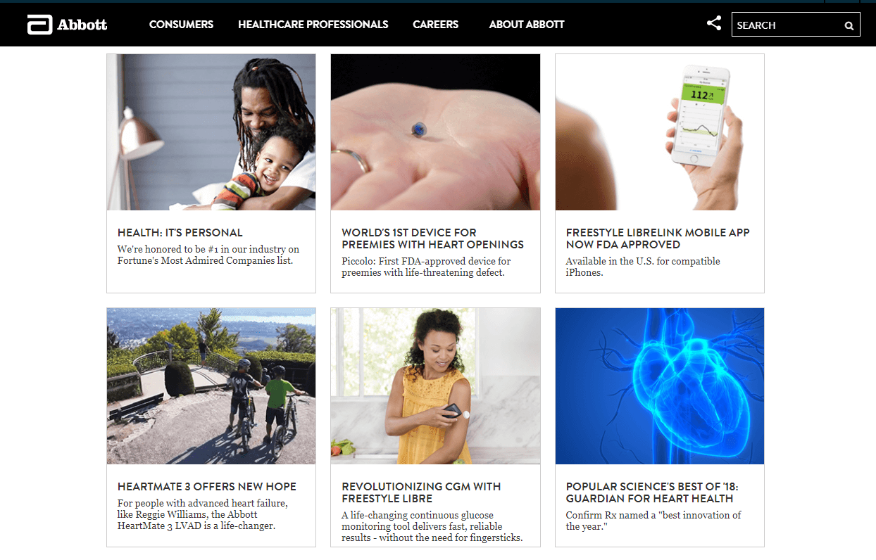
This combination of trending articles and emotionally engaging stories helps to position Abbott as a brand that focuses on bringing real benefits to patients through innovation and constant evolution. In other words, their website design sells a story that the average consumer can understand.
Engagement is a particularly important element for any effective pharmaceutical website, because if you’re unable to grab your audience’s attention on an initial visit then your efforts at educating or converting these visitors will be largely unsuccessful.
Encourage Participation

After you’ve drawn website visitors in, you need to ensure that they stick around and look deeper into your online offerings.
Introducing more dynamic elements into your website design can help you to retain user interest. In particular, think of smartphone-style gestures that involve swiping, scrolling, and tapping – all of these actions are natural to any mobile or tablet user. Offering these individuals more opportunities to interact with your content will encourage them to keep exploring.
You can also reward these actions, by adding custom animations and graphics to each new page. Alternatively, if you want to keep users scrolling on a single page, then break up chunks of text with video or images.
There are a number of reasons for this:
- Integrated media helps to make content more readable.
- Images and videos are far more likely to be shared by readers.
- Video is the dominant content delivery format on smartphones, adding relevant blog posts can decrease bounce rates on these devices.
- Humans process visual information at a much faster rate than text.
Iqvia is a US-based healthcare organization that focuses on developing products in biopharmaceutical and medical IT. Despite the highly technical nature of the company’s work, their website favors a streamlined look with original high resolution images, integrated video, and plenty of clickable links.
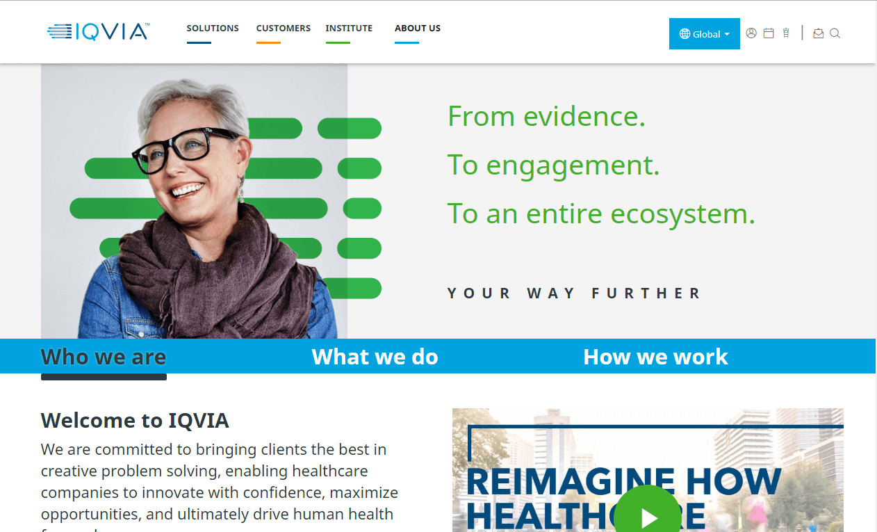
All of those components add up to an extremely inviting interface for even the most uninformed website visitor.
Make Navigation Simple
One of the biggest challenges to creating a UX-optimized pharmaceutical website design is deciding who to build your website for. After all, your target audience can range from academic researchers and employees to insurance companies, hospitals, and of course, the patients that are actually being treated with your products.
Despite this diversity of interests, you still have to ensure that your website is able to provide each visitor with their desired content as quickly and seamlessly as possible.
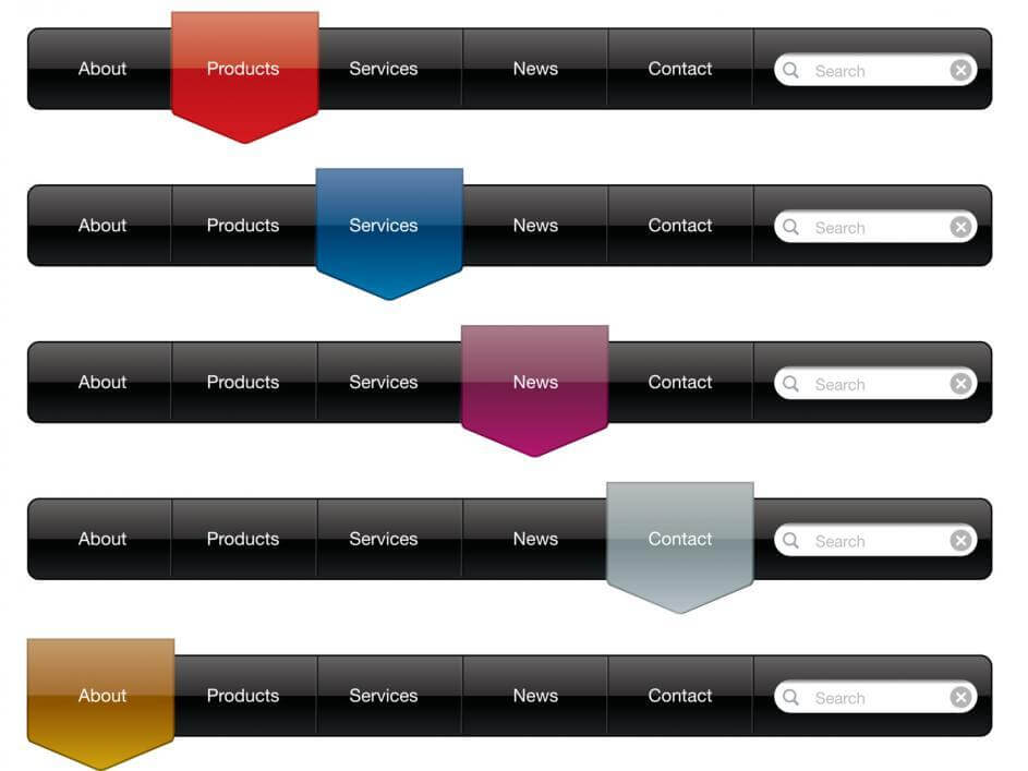
When a visitor arrives on your home page, they should be instantly met with a prominent menu bar that clearly illustrates the main sections of your website.
While it may be tempting to use this space for clever design flourishes, you’re better off sticking to the basics. Order your menu bar in a concise manner that places the user’s needs first and foremost.
For example, Swiss multinational Novartis provides a menu bar that has been split into four categories.
- A section for internal users and stakeholders interested in finding out more about the company.
- A section for external visitors who are looking for more information about the company’s main focus areas. This section also includes individual navigations for patients, healthcare professionals, researchers, and investors.
- A section for promotional material on Novartis’s technological innovations and research programs.
- A final section for individuals or companies that are either looking to join Novartis or partner with the brand.
Remember, this is a billion dollar company that sells its products all over the world. If they can manage to simplify their layout to such an extent, then there’s really no excuse for smaller organizations.
When it comes to ease of navigation, there are a couple of other factors to consider as well.
- Users should always be able to navigate back to the home page with a single click.
- Users should be able to navigate to the bottom of each service page with no more than two scrolls of their mouse wheel or upward swipes on their smartphone.
- Users should always be aware of exactly where they are located in the site hierarchy. Each page should be labeled, and the path to arrive on this specific page should also be displayed in an accessible location.
- Most pharmaceutical websites will contain links to other medical resources. These external links should be collected and integrated into the main menu so that users can continue their research with minimal hassle.
Make Each Page a Landing Page

While you may have optimized your landing page to lead visitors to the content they need, the truth is that most users will search for your services through search engines that guide to only the most relevant sections of your website.
So, if a prospective customer searches one of your drugs and ends up on a page that contains a lot of dense medical information, they’re more than likely to back out and opt for a less daunting portal. With this in mind, you need to ensure that all of your service or product pages can function independently as a landing page.
If we’re talking about medications, then the name of the specific drug should be shown at the top of the page, along with the specific conditions that it can treat. The rest of the page should follow the same principle. Make sure that the content that users need the most is displayed above the fold. This means everything from information on side effects to data on the effectiveness of the medication.
You must also include a clear call to action on each page, so that the user knows which actions they are supposed to take next.
For example, a drug page could include a link to a product availability page, which details where the medication is available. Alternatively, if a certain product is suspected of producing previously unforeseen side effects then you can integrate a contact form to allow visitors to reach out to relevant representatives right from the product page.
Visualize Data

Regardless of how streamlined and readable your website content is, it still doesn’t change the fact that you’re trying to communicate dense technical material to an often non-technical audience. When it comes to expressing complex information in a digestible form, nothing beats visualizations.
This isn’t a new concept by the way. Think about whether it’s easier to guide someone to their destination using nothing but words or to show them how to get there on a map. With graphics, you can demonstrate concepts that users would be hard-pressed to understand on a theoretical level.
Say you want to convince patients about the efficacy of a certain drug. Now, you could provide a lengthy case study which talks about the reduction in certain symptoms in a test group versus a control group over a certain period. While this approach would certainly be thorough, it’s definitely not going to be accessible for the layman. Nor is it going to be very interesting.
Now, take those same data points and plot them onto a dynamic graph that shows patient trends over a 10-year period. You can even add in some interactive elements that allow users to play around with the numbers and see how groups reacted to different medications or conditions. All of a sudden, you’ve managed to illustrate the value of years of research and you’ve even succeeded in getting your primary audience to engage with it.
Visualized data is also far more likely to be retained than text. Studies show that readers remember up to 65% of a visually transmitted message compared to just 10% of a comparative piece of written content.
Again, these are all core UX principles you’re creating memorable moments for a broad range of users in a completely differentiated manner. If you want to build a pharmaceutical brand that connects with empowered healthcare consumers, then these steps will be essential to your digital strategy.
