
The Top 8 Trends a Graphic Design Agency Should Know in 2022
Chris Mulvaney is the CEO of CMDS. I make things... I’m the creative entrepreneur with passion for (re)making brands and inventing solutions to problems no one knows exist.
Are you looking to hire a graphic design agency? If so, you’d probably like to know how to go about hiring the best one for your company. This is vital if you want your business to stand out.
But…let’s face it. Graphic design trends come and go. This is why your graphic design agency needs to stay on top of the trends rather than fall behind with the rest.
This year, trends from past decades are starting to resurface, but with a modern twist.
This is a pretty unique year for graphic design, so when it comes to those trends, there are a variety to choose from. The good news is that this gives your business the opportunity to experiment and find the perfect one. Heck, maybe you’ll even try more than one!
In this article, we are going to show you the latest graphic design ideas and how they can complement your brand (like peanut butter and jelly!). At the end, you should be able to know which ones are the best for you. After all, isn’t the point to stand out and make your brand more memorable?
Let’s start.
1. 90s Retro Is Coming Back
1. 90s Retro Is Coming Back
You read that right. The 90s are hot right now, particularly when it comes to graphic design. As Stephen King famously wrote: “Sooner or later, everything that is old is new again.” Honestly, he couldn’t have been more spot-on as it relates to the throwback trends we are seeing this year.
Not too long ago, we saw how brands started incorporating the 80s into their graphic designs. The Netflix hit show, Stranger Things, propelled the decade into the forefront. Suddenly, we were reminded of how vibrant the 80s were and how much people love nostalgia.
By reviving a retro genre, this current trend brings back all of what made the 90s just so great. Some examples are: vibrant colors, simple internet frames and designs, old-school video games, and movies that have become cult classics.
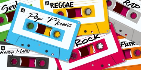
The idea is to show your audience everything that was good about the 90s while injecting your own brand and personality into it. Make it your own!
You can give those who lived in the ‘90s a taste of nostalgia, while at the same time, allow a younger audience to experience it through your brand’s designs.
Don’t think you’ll have to do a complete brand change as you take advantage of this trend. Remember, it’s a passing trend and you’re riding the nostalgia wave.
This style works perfectly for social media because it’s very appealing. The color palette makes it stand out from the muted minimalism you see every day on social media platforms like Instagram.
Your graphic design agency should not stray too far away from what your brand is known for. While changing things up here and there is great, making it so different that your followers don’t even recognize you is problematic.
A good graphic design agency is able to use this trend without changing your brand too much. They can give your social media posts a 90s feel and make it fun by adding some old-school references.
We believe that change is good for a brand, but a drastic change can do more harm than good. A passing trend is like a fad and won’t be around forever. Use it as an opportunity to stand out, but don’t overdo it.
Our next trend goes hand in hand with a 90s retro style, but it’s way more versatile and easy to apply to a brand.
2. Bold Backgrounds
2. Bold Backgrounds
While this might not seem as exciting, having a background that pops helps draws attention to a particular product or announcement. By having such a bright color in the background, people will stop scrolling to check what is there.
Background trends come and go at a rapid pace, but luckily, it’s a very easy trend to incorporate into your business.
You will see this trend appear mostly on product showcases and social media posts or thumbnails. Redesigning your website with a bold background is definitely not something we recommend your graphic design agency doing.
This year, you’ll see lots of bold colors everywhere as businesses hire graphic design agencies to help them incorporate this trend into their brand.
Something you can try is to use fonts and icons in high contrast colors on bold backgrounds. The idea is to make the overall design pop out more while drawing all of the attention to your icons and fonts.
This is especially good for sales copy and icons when you want to catch people’s attention. While it’s a helpful tool, we don’t advise that you do this on every single post and design. However, adding it here and there to shake things up will, without a doubt, cause people to pay attention to your design.
A graphic design agency would make sure to use a bold color that is similar to a color in your brand’s guidelines. This way, the overall aesthetics are on point and it doesn’t look weird or out of place.
3. 3D Designs And Illustrations
3. 3D Designs And Illustrations
With technology evolving over the past couple of years, 3D designs have become more common.
New software that is intuitive and easy to use for graphic designers makes 3D designs a more accessible style choice.
This trend is all about being creative and finding ways to incorporate 3D animation and design into your brand without it looking out of place. The last thing you want is to pour hours into a 3D design just for it to look strange next to your brand.
The beauty of 3D design is the sheer versatility it provides. With enough creativity, you can make a 3D design of just about anything.
That means it can be your product, a mascot for your brand, or some shapes to make your product stand out. The sky’s the limit.
Sometimes, all a design needs is a bit of depth. 3D modeling helps achieve that. Creating moving 3D animations that can blend in with your brand is also a great way to shake things up.
A good graphic design agency should be able to mix 3D designs and illustrations into both your website as well as your social media platforms. 3D designs not only look amazing but they also draw the attention of a LOT of users. This is exactly what you want to see on social media.
3D illustration is something your graphic design agency can mix and match with the other popular trends!
4. Minimalist Logos
4. Minimalist Logos
Did you know that lots of big companies have recently been simplifying their company logos? They aren’t doing this because it’s trendy and cool, but because it revitalizes a brand and makes it more memorable.
With big brands having a logo makeover, a lot of smaller brands have followed suit. But…what does simplifying your logo actually change?
These companies are looking to remove any sort of excessive detail their logo had in the first place. Anything that can be removed from the design without altering the logo is deleted.
The goal is for people to see the brand’s logo and instantly know what it’s about. With the average attention span decreasing by 25%, which translates to eight seconds, it’s easy to understand the importance of a good logo.
Minimalist logos achieve a very important goal and that is to make a brand recognizable, no matter the size or placement. A good minimalist logo should be concise and easy to understand.
KIA understood how important having a minimalist logo is and decided to change its emblem completely. They now have a sleek, modern-looking logo beside their slogan: “Movement That Inspires.”
![]()
Clear lines and shapes leave a lot less to interpretation and make it easy to understand what the brand is about. The same can be said of colors and details. You want to make sure that people don’t have a hard time trying to understand your logo.
An experienced graphic design agency will simplify your logo and make it memorable. This way, both loyal and new customers will know exactly who you are.
Our next point explores the idea of minimalism and the ways it benefits your brand.
5. Less Is More
5. Less Is More
Brands are always looking for ways to stand out while not being over the top. Any graphic design agency worth its salt knows this. Minimalism, when done right, can help your brand stand out.
Don’t get us wrong. We LOVE minimalism! But, there must be a uniqueness. Otherwise, you aren’t going to be noticed.
Think of minimalism as the main focus of your design and the use of different trends as a way to grab consumers’ attention. Use bold backgrounds to inject more color into your minimalist design. Or perhaps use 3D illustrations that stand out from your normal, understated designs.
You can even take that 90s nostalgia vibe and change the fonts and colors to make it genuinely feel like people are being transported to the past. There are thousands of ways to make your brand pop in a sea of minimalist brands.
What we don’t want you to do is use the same font, website style, and social media post thousands of brands are already using and just change the colors a bit. While they may look nice, you’re missing out on an opportunity. If anything, your brand will be very forgettable, something you definitely DON’T want.
If you want a complete minimalist overhaul, a graphic design agency is the best option. They’ll redesign your whole website in order to fit the minimalist aesthetics while making sure your social media posts fit the theme.
Now, what if we took the minimalism concept and we did the opposite? Would it be effective?
6. More Is More As Well
6. More Is More As Well
So, you’ve just heard of minimalism as one of the best ways to promote your brand. But what about the opposite? What about maximalism?
Graphic designers love maximalism because there are no boundaries. If anything, they’re free to add designs and ideas as they please.
Where minimalism uses soft lines and simple coloring, maximalism uses bold patterns, intricate shapes, and lots of layers.
Don’t get us wrong. Maximalism isn’t an anti-minimalism trend. It’s a trend of its own that shows you that more is indeed more.
Maximalism adds vibrant colors and isn’t afraid to make them clash in order to get its point across. Minimalism uses bold colors to accentuate a specific part of a design. With maximalism, on the other hand, you’re turning it up to eleven and using bold colors everywhere in your design.
Making sure to mix and match different styles of art is also a common practice for maximalism. You will see collages of different art styles and patterns ranging from realism all the way to abstract designs.
On paper, the idea of mixing different art styles may not sound good, but the result from maximalism can often surprise you.
The ultimate goal is to create an organized chaos of sorts. So, that all sounds great, but what does it have to do with your brand? Well, first of all, it solves the big minimalism bubble brands are in right now. It’s easier for you to stand out with maximalist designs if everyone is playing it safe with theirs.
A good graphic design agency would look for a way to add a bit of maximalism flair to your brand. In places like social media where you’re able to take more risks, maximalism helps you stand out from the crowd.
The biggest advantage of maximalism? There are barely any boundaries. While minimalism follows a decently strict process and idea, maximalism throws that all away and lets you create to your heart’s content.
7. Experimental Typography
7. Experimental Typography
Do you know typography has become fun again? In the quest to stand out, brands have tried to incorporate interesting and scroll-stopping typography. But, is it really worth it?
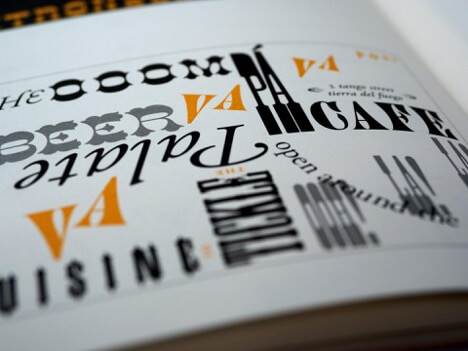
Similar to what we’ve mentioned before, the goal of experimenting with fonts is to find a way to catch people’s attention. Try different fonts and add varying shapes and lines to your designs. Just be careful to not overdo it when trying new fonts. The last thing you want is for it to be so artistic that people can’t read it. We’re looking at you, heavy metal bands.
Now, which type of fonts should your graphic design agency use as a foundation for your experiment? Right now, Serif Fonts are all the rage because of how legible they are and how easily you can customize them.
This means the Serif Fonts are perfect if you want to make a font design that is different and that catches people by surprise.
Ideally, you’d want a typography design that stands out so it makes people stop to read it. Remember to not make it super complicated or people might just end up not being able to read the message you’re sending out.
It’s a fine line and it’s hard to know when you’ve crossed it. That’s why this job is generally suited for a graphic design agency with years of experience. They’ll be able to give you a typography design you’ll be able to use anywhere you want.
And, like all of the other trends before, you can use this one in conjunction with other styles such as minimalism.
8. Gradients
8. Gradients
Gradients are the perfect pairing for minimalist designs since they add a splash of color to your brand without it being over the top. From muted and dreamy pastel colors to vibrant and contrast-heavy designs, gradients are for everyone.
Versatility is what makes gradients so amazing, and why you want to use them as much as possible. They add life to a simple and boring background.
A graphic design agency would most likely tell you to go for a dreamy and almost ethereal-looking gradient. These will have very soft pastel colors and will blend in with white-colored fonts very well.
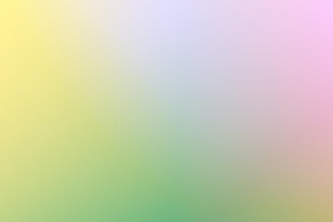
This combination makes your brand look very casual and laid back while engendering a sense of modernism and elegance.
These gradients can be used on your products, your social media, your website, and anything else to promote your brand.
Conclusion
Conclusion
You now know the eight hottest and most important graphic design trends to incorporate into your brand in 2022. Think of them as an opportunity to transform or renew your brand. Most importantly, the graphic design agency you hired should know and capitalize on these trends!
Let’s do a quick recap.
First, we talked about how the 90s nostalgia is coming back. This is a trend that resurfaced when the Netflix hit show, Stranger Things, aired and brought with it the 80s craze. We’re seeing the exact thing happening with the current 90s trend and we’re all for it!
Next, we mentioned how bold backgrounds can help a product or announcement stand out.
We also talked about how 3D designs are becoming more accessible for designers, and pointed out that you’ll start seeing them everywhere.
We showed you how big brands changed their detail-heavy logos to something simpler and easy-to-understand. We gave you an explanation of why they chose to make the change.
We talked about minimalism for brands and how it’s still a very popular and good-looking trend for any sort of business. But, we also mentioned the polar opposite, known as maximalism. We talked about how using it here and there can yield better results in order to stand out in a sea of minimalist designs.
Then, we mentioned why Serif Fonts are everywhere and why you should experiment with your fonts more in 2022.
Last, but not least, we mentioned how gradients are the perfect way to fill empty white space without filling it with unnecessary junk.
If you have any questions to ask or thoughts to share about graphic design trends for 2002, leave them down below in the comments. We’ll get to you as soon as we can.
